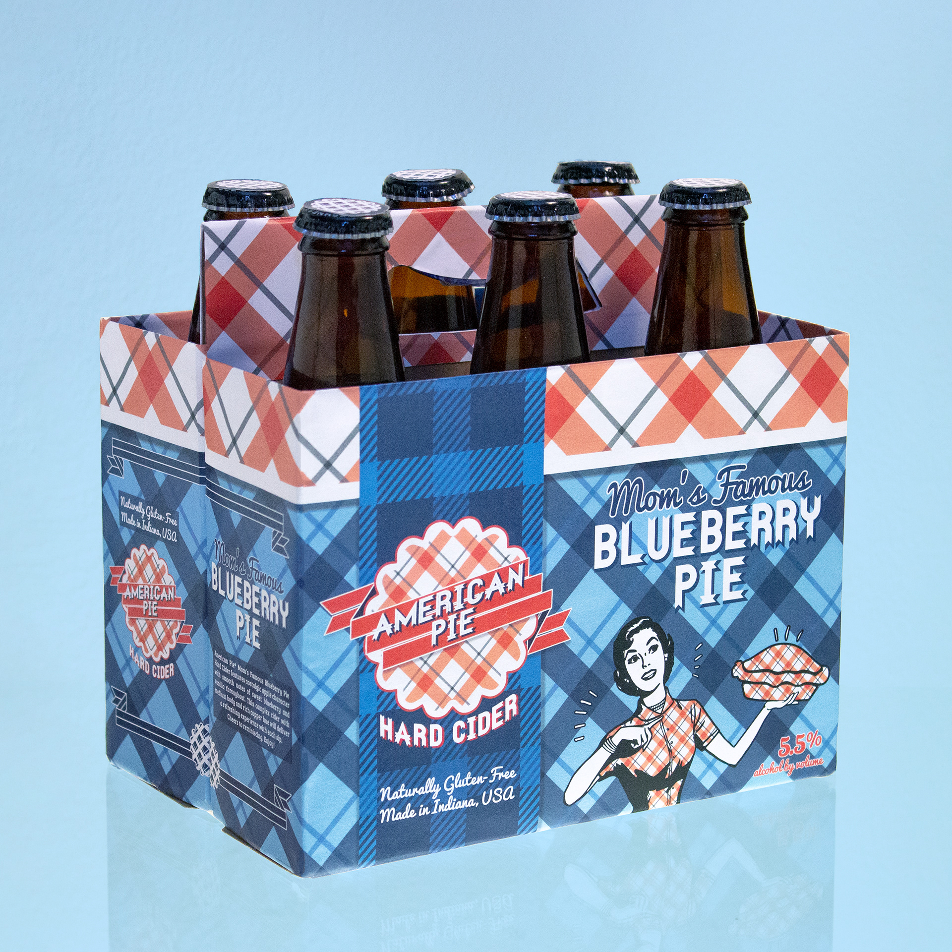
2015 - American Pie Hard Cider
Ah, what humble beginnings. This design child started their younger years as a college assignment. My aim was to create a pie-flavored cider that evokes mid-century Americana. I printed, cut, and pasted this custom packaging design on a dismantled 6-pack of Woodchuck Cider then photographed the end result. Little did I know, I wouldn't be able to put this project down. While there are elements I love, there are many design mistakes I needed to improve on in order for them to be visually appealing. A year later, I removed the overly busy packaging and showcased only the bottle cap logo in my portfolio.

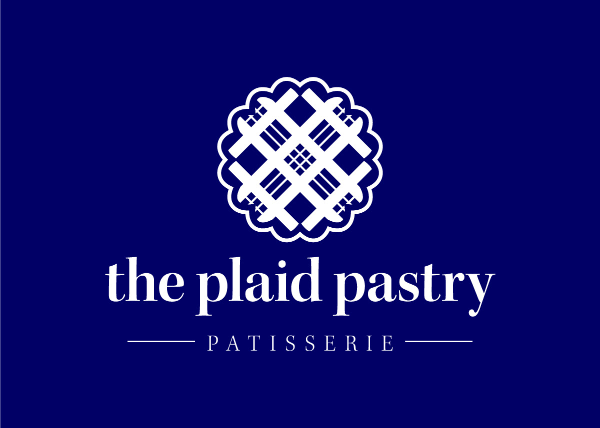
2019 - The Plaid Pastry Patisserie
After graduating from college and working in the corporate design world, my graphic design eye matured. I knew I had one spectacular element in this project - a plaid pie crust logo. I decided to retire the hard cider concept and repurpose it as bakery branding. After landing on an alliterated name, "The Plaid Pastry," the refining of the logo began. My style inspiration was a timeless, French patisserie. The project came back to life in a whole new form. But that's not the end of the road for this design idea.
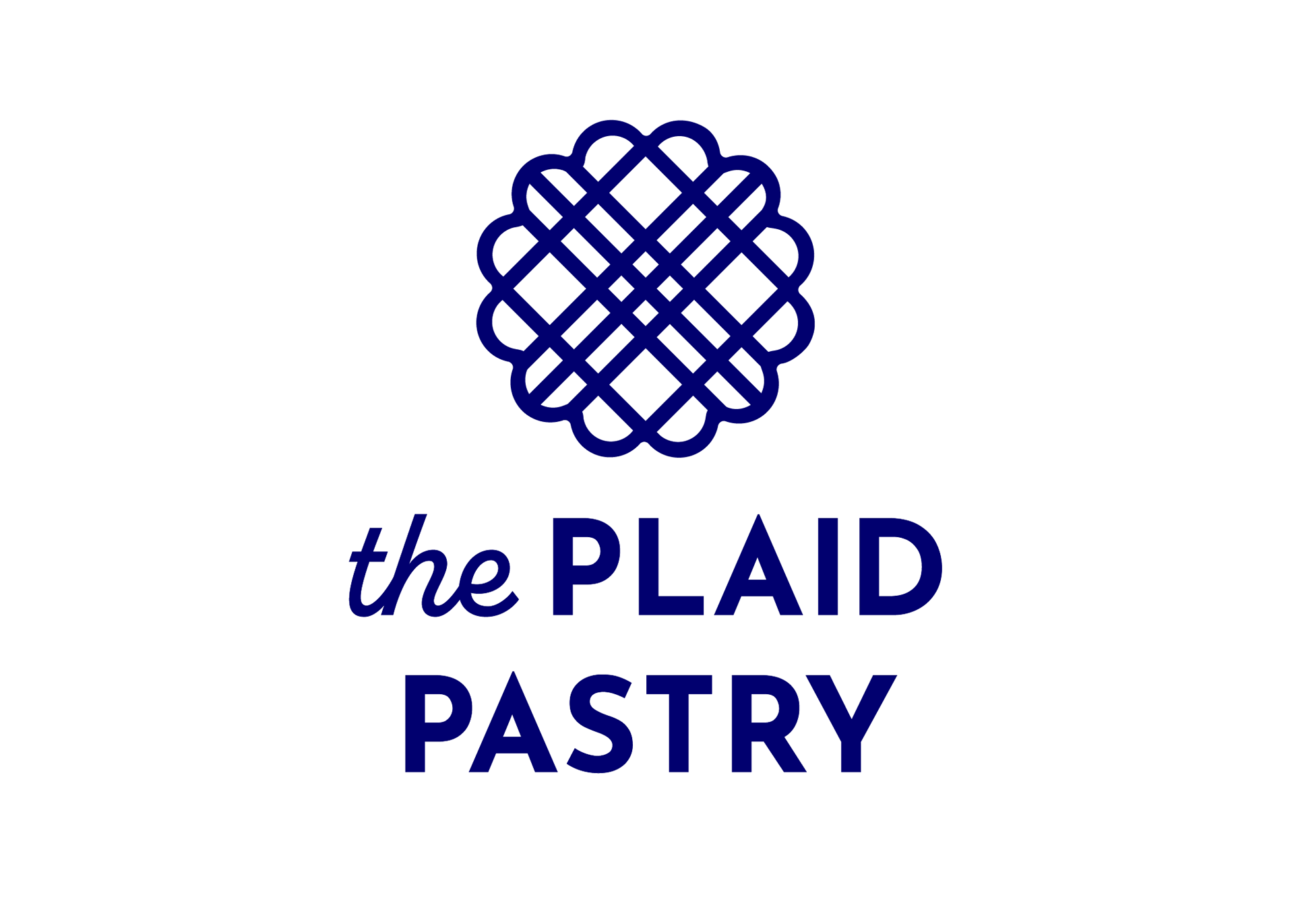
2022 - The Plaid Pastry
I reimagined the bakery as a youthful, trendy-yet-timeless, minimal-yet-bold coffee and bakery shop. Simple and geometric, the curves and straight lines echo between the logo and typography. The same stroke weight is carried throughout the logo and simplified the rather detailed shape. Inspired by the many boutique bakeries I saw when I lived in downtown Los Angeles.